The future of digital
Discover the trends, tech, and strategic insights shaping tomorrow's digital landscape. Written by experts, curated for innovators.
.avif)
When Bluetooth devices compete: how we solve multi-device BLE challenges
The challenge most apps underestimate
Once the platform scaled, new needs emerged:
- Reliable location detection: To ensure users could always end their rides, even in GPS-poor environments like underground stations, we implemented Beacon technology as a vital fallback.
- Maintenance access: Service teams needed dedicated BLE access to battery locks for maintenance purposes.
Suddenly, the app wasn’t talking to one device anymore. It was juggling multiple Bluetooth interactions at the same time.
And that’s where things started to break.
One BLE radio, multiple demands
Smartphones only have one Bluetooth radio. Yet many apps treat it like an unlimited resource.
In practice, this leads to:
- Silent scan interruptions (especially on Android)
- Features interfering with each other
- Device-specific bugs that are hard to reproduce
- “Works most of the time” experiences that frustrate users
For platforms like Blue-bike, this directly impacts both user experience and operations. To solve this, we leveraged our partnership to build a robust architecture that treats Bluetooth as a shared system resource.
Our approach: treat BLE as a shared resource
At icapps, we’ve seen this pattern before across multiple projects. When apps evolve, Bluetooth complexity grows with them.
Instead of patching issues later, we design for it upfront.
The key insight is simple: Bluetooth should be managed like any shared system resource.
Meaning: just as a processor decides which app gets processing power, there needs to be a system that determines which function is allowed to use the Bluetooth antenna at any given moment. Without this central management, different parts of the app (such as unlocking the lock versus searching for beacons) will compete with each other for the connection, leading to failed actions and a frustrated user.
The solution: a scan coordinator
To prevent conflicts between BLE features, we implemented a centralized scan coordinator.
In short, it:
- Controls who can scan at any given time
- Assigns priorities (user actions over background processes)
- Temporarily pauses lower-priority scans
- Applies rate limiting to avoid OS restrictions
- Ensures consistent behavior across devices
This creates a predictable and stable Bluetooth layer, even as new features are added.
Why this matters for your product
If your app connects to just one device, you might never notice this problem.
But if you’re building:
- A connected product ecosystem
- A mobility or IoT platform
- A feature roadmap with future integrations
…this challenge will surface sooner or later.
And when it does, it won’t show up in testing. It will show up in production.
Designing for scale from day one
What we built for Blue-bike is not a workaround. It’s a scalable foundation.
By centralizing BLE coordination:
- User interactions become reliable
- Background processes stay invisible but effective
- New integrations don’t introduce new risks
Most importantly, it allows teams to keep innovating without breaking existing functionality.
What this says about how we work
This project reflects how we approach digital products at icapps.
We don’t just build what’s needed today.
We anticipate what your product will need tomorrow.
Because in connected ecosystems, small technical decisions can have a big impact on user experience.
If you’re working on a product with Bluetooth, IoT or multiple device integrations, it’s worth asking: Are we building for today’s use case… or tomorrow’s complexity?
FAQ: Bluetooth and multi-device BLE
What is multi-device BLE?
It refers to apps interacting with multiple Bluetooth Low Energy devices, common in IoT, mobility, and connected products.
Why does Bluetooth fail with multiple devices?
Because smartphones only have one BLE radio. Multiple scans or connections can interfere, causing unreliable behavior.
How do you manage multiple BLE interactions?
By using a centralized approach, like a scan coordinator, to control access, prioritize actions, and prevent conflicts.
What are common BLE issues in mobile apps?
Unstable connections, background limitations, Android restrictions, and conflicts between multiple Bluetooth processes.
When do you need a scan coordinator?
As soon as your app connects to multiple devices or combines background and foreground BLE features
All insights
.avif)
5 key advantages of React Native
In an earlier blog we discussed the who, what, why and when of the Facebook-originated React development framework. We already mentioned the existence of React Native, the mobile partner in crime, as an extra reason to start using React. But why would this partner in crime be a reason in itself to choose for React? To answer this question, let’s simply highlight the main advantages of React Native.
1. React Native is Community-driven
The development of the React Native framework actually started as a hackathon effort in 2013, responding to the need of the developer community: it was looking for a mobile alternative that would combine the advantages of mobile app development with the power and agility of the native React environment. This resulted in React Native, a framework created by Facebook, and supported and continuously pushed forward by the development community.
There are considerable advantages to using such a community-driven environment like the availability of a huge team of enthusiastic JS and native developers willing to share their knowledge and expertise and huge catalogs of freely available components.
2. Maximum code reuse & cost saving
By using React Native, you can use the same code for deployment on iOS as well as on Android. This means a huge saving in development time and cost. Theoretically, the development effort could be cut by half. In practice, the cost saving will be a little lower but still more than interesting enough to make the investment worth your while. According to recent calculations, about 90% of the code can be reused between Android and iOS, but it would be wise to calculate some extra time for practical modifications as well.
3. Live reload
React Native might be considered as the mobile next step after React: It builds on the React ideas and allows you to create powerful mobile applications. In fact, React Native features an interesting extra that you will not find in the native frameworks: the ‘live reload’ feature, enabling you to immediately see the result of the latest change that you have made to the code. If you have two windows opened – one containing the code and the other showing a mobile screen as a result of the code – you can immediately see the effect of what you have changed in one screen, on the other screen.
4. Strong performance for mobile environments
The React Native architecture is very well tuned to mobile devices. It makes use of the GPU (Graphics Processing Unit), while native platforms are more ‘CPU (Central Processing Unit) intensive’. Compared to hybrid technologies – which was the only option for cross-platform in the past – React Native is superfast.
5. Modular and intuitive architecture similar to React
The same advantage that was already mentioned for using React can be highlighted here: the modular and intuitive interface makes it very easy for other developers to delve into someone else’s project and build upon it. This increases the flexibility within a development team, and makes it easier to create updates and upgrades to web applications. Additionally, testers will need less time to understand the programming logic and build appropriate testing scenarios. This will lead to valuable time-savings, which is a message that any customer and/or CFO loves to hear. Especially when this advantage is extended from web to mobile and vice versa.
.avif)
How Product Strategy is different from your other strategies
Ready to create a digital product? Awesome. Got questions? Of course, you have! But be warned: at icapps, our experience tells us that certain beliefs are clear signs you don’t have a digital product strategy in place. In this series of blog articles, we explore these signs and explain how the right strategy can set you on the path to success.
In our last blog we talked about your target audience and how to adapt to change. Today we'll explore how Product strategy is different from other business strategies.
You believe a brand strategy and a marketing strategy suffice for the setup of your digital product.
What are your goals as a business? Perhaps you’re happy paying the bills. Maybe you’re looking to introduce new processes and technologies to revolutionize your industry. And of course, you might have your heart set on global domination. Whatever your aim, the path to fulfilling your business goals is set in your business strategy. Within it, there are other kinds of strategies, like your brand strategy, marketing strategy, and product strategies. If you’ve already got a brand and marketing strategy, we understand that you might feel like a product strategy—or a digital product strategy—isn’t necessary. But that’s a clear sign you haven’t discovered just how much this kind of strategy helps you. And when you’re pursuing your business goal, you probably need all the help you can get. Global domination isn’t easy.
Different types of strategies, different types of goals
First, a pat on the back. If you already have a brand strategy and a marketing strategy in place, you’re on the right track. In fact, they’ve probably given you a clear idea of what you want to do with your digital product. And no wonder. These strategies partly overlap with what goes into a digital product strategy.
Although they overlap, they don’t actually cover every base. That would just be too convenient.
By looking at how the various strategies do and don’t work together, you’ll see that all three examine different aspects of your target group. A quick example: while your brand strategy delves into how you want your company or organization to be seen by your target group, your marketing strategy specifies how you reach them. And your digital product strategy looks at how your digital product relates to your target group. How? By answering all kinds of important questions.
Time to reflect
What needs will your digital product fulfill? What needs are there that nothing else on the market meets? Is your digital product going to be used by technicians and sales staff on tablets and phones, or by office staff working with desktop computers? Will everyone using the product need access to all features? What are the plans for digital security? What programs will your digital product need to be compatible with? These are the sorts of questions your digital product strategy will answer.
Of course, just like your other strategies, your digital product strategy investigates things other than just the target group. It asks questions about every facet of what you want to accomplish and how you can best accomplish it. Unlike your other strategies, all the questions you ask as part of your digital product strategy relate to your digital product.
When all these questions are answered, you have plenty of insight into your digital product and how it relates to your business goals. You use this knowledge to create a roadmap that sums up what you’re doing with your digital product, why you’re doing it, when you’re doing it and how you’re doing it.
It’s part of a long-term vision you follow even after you’ve launched your product. Why? Because after it’s launched, your digital product will have an impact on your business, your brand, and even your marketing. And as long as your digital product is helping you achieve your goals, you’ll want to keep your digital product strategy up to date. Do this and you’ll keep meeting your clients’ needs and expectations while doing what you have to do to achieve your business goals.
You might also find that changes to your marketing or brand strategies influence your digital product strategy. And vice-versa. For this reason, you’ll want everyone associated with your project to be involved when you’re creating, updating, or adapting your digital product research. That will help you to develop a shared vision. One where everyone understands what you’re doing, why you’re doing it, when you’re doing it and how you’re doing it. Just as you’ll understand the factors that influence everything from the brand and marketing aspect. And knowing this means you’ll work much better and far more efficiently than you would ever do otherwise.
Would you like to know more about digital product strategy? Or to gain insights into your target group? Wondering what tomorrow will bring for you? Get in touch with icapps. We don’t have a crystal ball to tell you what the future will bring. But we have top-notch coffee. More importantly, we have the experience and insight into digital product strategy that will make a world of difference to your business.
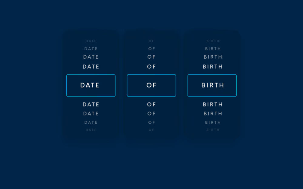
User experience of your daily frustrations: the Date of Birth input field
The simple dropdown
This type of input field asks you to pick the day, month, and year of your date of birth separately. Although it seems quite straightforward, it requires a lot of scrolling, especially for older people. So, in most cases, we notice that users tend to feel either very old or very underaged. Besides that, how do you determine a good default date?

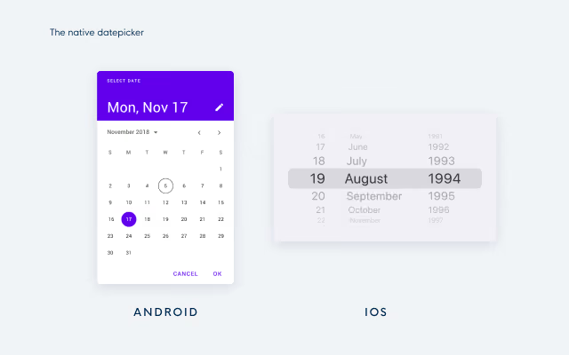
The native date picker
Next up is the native date picker. This DOB picker asks you to select a date from a calendar that pops up once you click on the input field. We see this both on Desktop and on Mobile. Although you might think that this solution is thought through as this is a native solution, it creates issues similar to the simple dropdown. It is nearly impossible to choose a good default date so users need to click or tap a lot to find their date of birth. This method was designed with the false assumption in mind that it's less effort to select a date of birth than to type it. In other words, native date pickers are not suitable for dates of birth and it is better to limit their use to other types of date picking, eg. scheduling an appointment in the near future.
We see this type of date picker both on Android and iOS devices:
The manual input field
The last, most seen method is the date of birth field with only one input field for the day - month - year. As soon as you start typing, the placeholder disappears. Since people are used to different formats, this method makes it impossible for users to check whether they have entered their date of birth right according to the format. Other than that, users are often confused about what separator they are allowed to enter in the field. Sometimes the field requires the use of a comma as a separator, sometimes the use of a slash or dash is required, and in some cases, an error is thrown when separators are typed because no separators are allowed.
In other words, it is tricky for users to fill in the right format. And last but not least, this input field is also harder to perform inline validation on because more error states are possible (eg. you can use the wrong type of characters) and some incorrect input can not be detected (eg. switching day and month by mistake).

You heard it, a lot of hassle just to enter your birthday right.
Let's see how it's done, the user-friendly way
The best way to ask someone’s date of birth is to avoid asking it altogether and to retrieve it from a social or governmental login like Itsme or Google instead. However, not everyone wants to use these logins so your solution might not work for them. In this case, the format of 3 separate input fields for day, month, and year seems the most user-friendly way of asking the date of birth.
Why? With its clear labels it prevents users from making mistakes against the date format and the labels allow them to double-check their input easily, it is not possible to accidentally enter wrong date formats, no excessive scrolling or tapping through months and years is needed and no default date should be set. Other than that, it is technically easy to validate the 3 input fields as no separators need to be checked and no wrong date formats can be used.
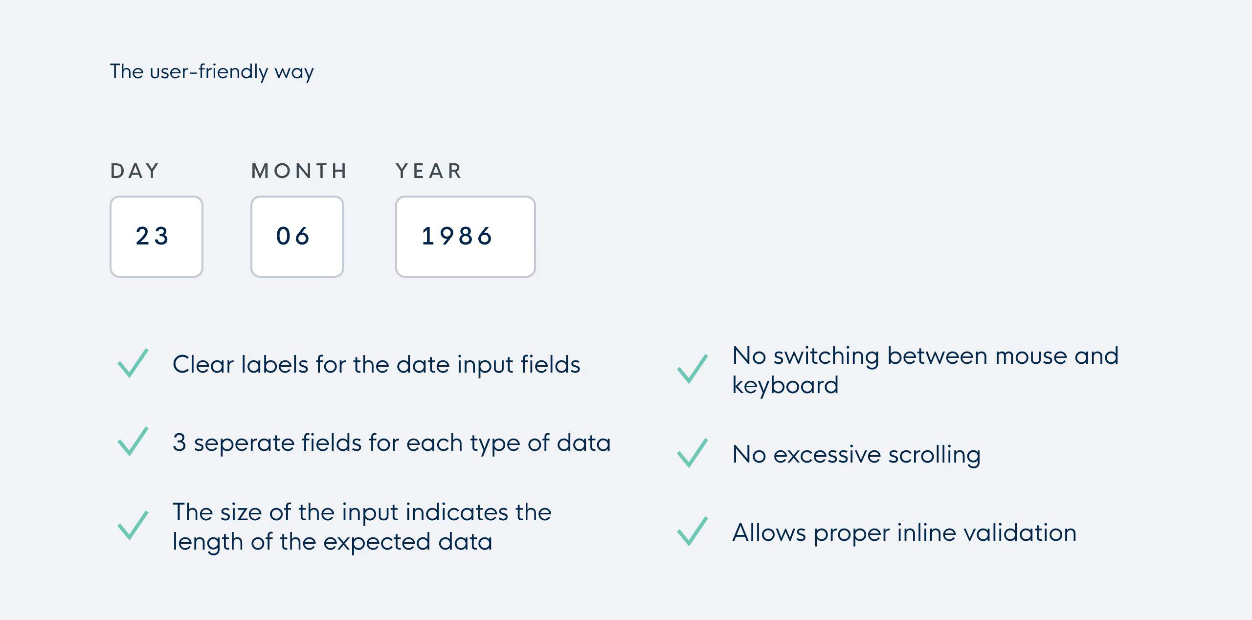
The only possible downside is that you need your tab to go from one field to another but compared to the excessive scrolling and tapping in native date pickers and dropdowns, we only see this as a minor issue.

Progressive web apps: why and how to build a "website on steroids"
Why build a Progressive web app?
1. Work reliably
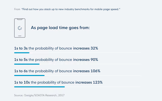
The first reason is: to make a web app work reliably regardless of the network connection.
By focusing on fast and reliable apps, PWA's are more user-friendly in low-connection circumstances. Even if you lost your connection for a while.
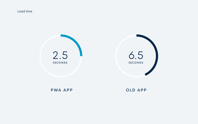
When your network connection is good, you still get the benefit of a faster website compared to a classic web app. Forbes improved its load time from 6.5 seconds on the old app to 2.5 seconds on its new PWA.
2. Increased conversions
Working reliably is a good feature, that also contributes to the second benefit: the increase of conversions. To clarify: conversion rates are the percentage of prospective customers who perform a specific desired action. For Uber that would be ordering a ride, for Tinder it would be looking at profiles and swiping left or right, and for Pinterest visiting your board and pinning stuff.
A lot of companies have already signaled that their move to PWAs caused an increase in conversions, user engagement, and average time spent on the web app. Here are some examples:
- Treebo: Year over Year conversion Rate increased by 4 times
- Lancôme: 17% increase in conversions
- Pinterest: 44% increase in user-generated ad revenue
- Trivago: Increased engagement led to a 97% increase in click-outs to hotel offers
A good place to look for more statistics about this is https://www.pwastats.com/
The reason for this is simple. PWA's remove a lot of obstacles that would cause users to leave your site. By being more user-friendly, fast, and reliable, people are more inclined to visit more pages and stay longer.
An alternative for Native apps?
There are also companies that are looking into PWA's as an alternative for native apps. While we are still a long way from PWA's being an equal competitor, there are some promising benefits.
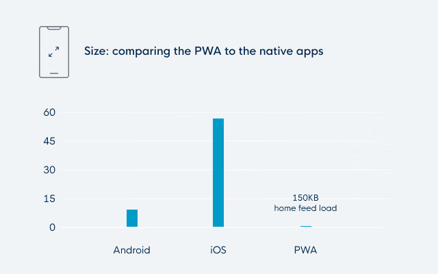
The first argument is that PWA's have lower commitment. By that, we mean that they have a smaller app size and that they are easily discoverable and shareable. For example, Pinterest has an iOS app of 56MB while the PWA only needs 150KB to load the home page. While the PWA loads code for new routes on demand, it still doesn't cost as much data as the app download. This makes it more likely for users that are minding their storage to keep your app. Users are also far less likely to download an app merely to browse some pages. This is something that is done way more easily on a web app (which you can then add to your home screen once you notice that you're using it often).
A second argument is that you are not tied to the app store and play store (and possibly their restrictions). You can simply deploy a new version without much fuzz.
But if you still feel that availability on the store is important for your app, you can add it to the play store as a TWA (Trusted Web Activity). For iOS, there is currently no plan to incorporate PWAs in the app store. But this isn't a big deal, since it isn't the main objective of a Progressive web app, but rather an added bonus.
The last argument is that there is no (or less) development needed for multiple platforms. You could view it as the ultimate hybrid solution, developing web and mobile in one go. But it is important to remember that each browser possibly needs some fine-tuning.
Looking at it from the native app fan club's side, you may argue that PWAs currently have fewer device capabilities and that some of the available capabilities are not supported on all browsers yet. To give some examples:
- Push notifications are not yet possible on iOS.
- Contact picker has just been added to Chrome on Android and is not available on other browsers yet.
So the least you can say is that it is a relatively new technology. You should, as always, look at it case by case. A messenger app with contacts and push notifications is probably not the best fit for a PWA. But an app that can also work as a website and would benefit from the features of a PWA? Perfect!
Technological Requirements for Progressive web apps
Let's end with a look at what we need to make a PWA and what is possible.
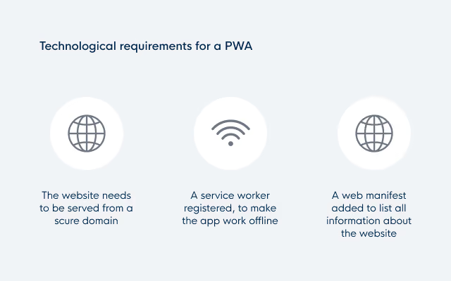
- The website needs to be served from a secure domain.
- A service worker needs to be registered to make the app work offline. (This is currently only required by Chrome for Android )
- A web manifest needs to be added to list all information about the website.
Let's take a closer look at those last two, service workers and the web manifest.
Service workers
A service worker is a script that your browser runs in the background, separately from a web page. For PWAs it is mostly used as a virtual proxy between browser and network. It improves page speed and adds offline capabilities by caching assets.
The service worker also enables features such as push notifications and background syncs.
App manifest
The web app manifest defines the behavior when installed on the device. With fields like:
- Name
- Icons
- Background color
- Orientation
- Display (going from normal browser look-and-feel to a full-screen native-like experience)
Thanks to the manifest, a PWA can function and look like a stand-alone app.
Browser support for PWA's
Let's conclude with an overview of browser support.
Mobile
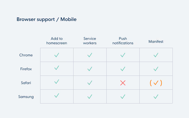
Progressive web apps are really mobile-first. Most browsers are fully supported. iOS is the odd one out. While they have made some improvements towards PWA's in more recent versions, push notifications are still not available and the manifest doesn't enjoy full support (but there are ways around it by adding custom logic for iOS).
Desktop
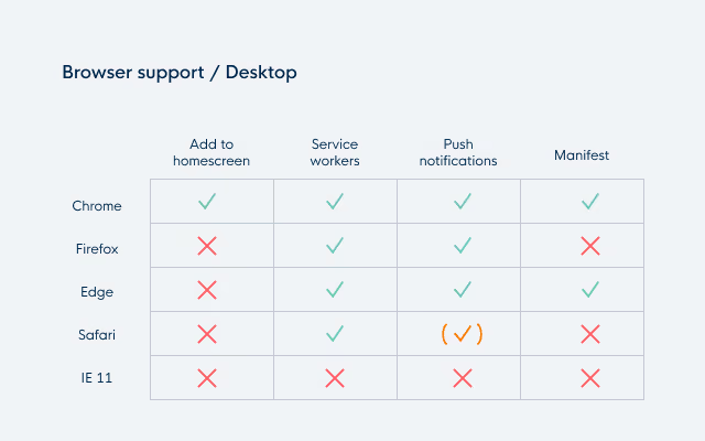
On desktop, it is a different story. It is clear that Chrome is trying to be the forerunner for the desktop PWA. A standalone app is currently only possible on Chrome or Edge. Push notifications are possible on all browsers, but for Safari you need to implement a proprietary solution.
As expected, Internet Explorer has none of the PWA features. But that's where the P (Progressive) in PWA comes into play. You can implement it for all browsers and just have a lesser, but still sufficient, experience on IE.
Conclusion
So in conclusion, Progressive web apps are a promising technology that can either be used as a means to improve existing websites or as an alternative for native apps (though this is on a case-by-case basis). This won't be the last you've heard of them, so keep an eye on them. Or even better, start building them!
Clarity to your digital challenge?
Whether you’re modernising a complex IT landscape or building a digital product that must scale and last, it always starts with the right conversation.